In Washington state earlier this month, an appeals court threw out a murder conviction based on shoddy work by the defense. But the court also took the prosecutor to task for something even stranger: a bad PowerPoint presentation.
The prosecutor had dressed up her closing argument to the jury with a series of slides, complete with “sound effects and animation,” the appellate court wrote. On one slide, footprints materialized across the bottom of the screen. Other slides exhibited “concentric rings of a target,” with each ring corresponding to an item of evidence; the defendant’s name, Sergey Fedoruk, was in the bull’s-eye. The prosecution’s final slide, the pièce de résistance, opened with a header that said “Murder 2.” Then, under the header, a single word flashed, in all capital letters, in 96-point red type:

As the word flashed, the prosecutor told the jury: “The defendant is guilty, guilty, guilty.”
At least 10 times in the last two years, US courts have reversed a criminal conviction because prosecutors violated the rules of fair argument with PowerPoint. In even more cases, an appellate court has taken note of such misconduct while upholding the conviction anyway or while reversing on other grounds (as in the case of Sergey Fedoruk). Legal watchdogs have long asserted that prosecutors have plenty of ways to quietly put their thumb on the scales of justice —such as concealing exculpatory evidence, eliminating jury-pool members based on race, and so on. Now they can add another category: prosecution by PowerPoint. “It’s the classic ‘A picture is worth a thousand words,’” said Eric Broman, a Seattle attorney who focuses on criminal appeals. “Until the courts say where the boundaries are, prosecutors will continue to test the boundaries.”
Perhaps the most common misuse of what some legal scholars call “visual advocacy” is the emblazoning of the word “Guilty” across a defendant’s photo. Almost always the letters are red—the “color of blood and the color used to denote losses,” as one court wrote. Two months ago the Court of Appeals of Missouri ruled in a case where the prosecution, in closing argument, presented the following slide:

The defendant, Chadwick Leland Walter, had been convicted of attempting to manufacture methamphetamine and of maintaining a public nuisance. The photo used for the slide was Walter’s booking photo—hence, the orange jail clothing. As the appeals court noted, the state could not force Walter to appear before a jury in jail garb, because that could undermine the presumption of innocence. But the prosecution’s use of the booking photo had the same effect.
The appeals court said it “defies logic” that a prosecutor would tempt a mistrial through such an “egregious” tactic. Still, the court affirmed Walter’s convictions because the defense attorney didn’t object until after the verdict and because the prosecution’s evidence was “overwhelming,” making it unlikely the misconduct was a deciding factor.
In a case out of Pierce County, Washington, prosecutors went one step further. Edward Glasmann was charged with assault, robbery, kidnapping and obstruction of a police officer. When police arrested him, they used a stun gun and stomped on his head. In closing argument, prosecutors used Glasmann’s booking photo in three consecutive slides. The first slide superimposed—diagonally—the word “GUILTY” across Glasmann’s bloodied and battered face. The next added a second diagonal “GUILTY,” the words now forming an X. The final slide added a third “GUILTY,” this one running horizontally. We couldn’t dig up color versions of the slides (the type was red, by the way), but here’s what they looked like in black and white:

In December 2012 the Washington Supreme Court threw out Glasmann’s convictions based on the “highly inflammatory” slides. As a general rule, courts don’t want prosecutors expressing their personal opinion to a jury; they’re supposed to couch their arguments in terms of what the evidence shows. Plastering the word “GUILTY” on a slide—not once or twice, but three times—was a “flagrant and ill intentioned” violation of this principle, the Washington Supreme Court wrote. The captions superimposed on the photos were “the equivalent of unadmitted evidence.”
One justice, Tom Chambers, wrote that he was stunned at the state’s contention that there was nothing wrong with digitally altering the booking photo. “Under the State’s logic, in a shooting case, there would be nothing improper with the State altering an image of the accused by photoshopping a gun into his hand,” Chambers wrote.
Jeffrey Ellis, a lawyer from Portland, Oregon, represented Glasmann on appeal. “We all know that commercials can try to persuade people on a subconscious level,” Ellis said in an interview. “But I don’t think the criminal-justice system wants to enter into that base arena.” This year, in June, Ellis prevailed in yet another appeal that challenged the prosecution’s use of PowerPoint. Ellis’s client in that case, Jay Earl McKague, had been convicted in Washington of theft and assault—and sentenced, as a persistent offender, to life without parole. A Washington appeals court threw out the conviction because of this slide:
The court called this slide—featuring a picture of McKague taken by a security camera—“a calculated device employed by the prosecutor to manipulate the jury’s reasoned deliberation and impair its fact-finding function.”
Prosecutors, for their part, acknowledge that they need to take the same care with their visual aids as they do with spoken words. “Visuals are a part of any modern trial,” Pierce County’s prosecuting attorney, Mark Lindquist, said in an interview. “We use PowerPoint now instead of a chalkboard. But the basic ideas remain the same.” Just as prosecutors 30 years ago could not write across an exhibit in red ink, they can’t do it now with a software program, he said, adding: “New tools, old rules.”
The use of sophisticated visuals in the courtroom has boomed in recent years, thanks to research on the power of show-and-tell. DecisionQuest, a trial consulting firm, tells lawyers that when they give jurors information verbally, only 10 percent of them retain it after three days. But if the lawyers provide that information visually as well, juror retention zooms to 65 percent. Lawyers in both civil and criminal cases have seized upon this advantage, integrating visuals ranging from simple slides to animated graphics into their courtroom presentations. In one civil case in Los Angeles County, a plaintiff spent $60,000 on a PowerPoint slide show.
Prosecutors, meanwhile, have used slides in a variety of creative ways, from displaying a bloody butcher knife on a five-foot-by-five-foot screen (Missouri), to quoting Marlon Brando from “The Godfather” (Hawaii), to depicting the defendant as the devil. (That happened in Ohio, where a state appeals court referred to the image as “flagrant overstepping of the bounds of professionalism and decorum,” but upheld the conviction anyway.)
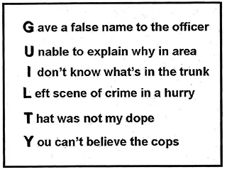
In 2003, the training arm of the National District Attorneys Association—“America’s School for Prosecutors,” is how it bills itself—published a 290-page book that advises prosecutors on how to use visual aids. To be taken seriously, the book says, “stay away from the frilly, soft colors.” Unsubtle visual jokes figure prominently in the lessons. One chart displays evidence on a loaf of bread: “HOWEVER YOU SLICE IT DEFENDANT IS GUILTY.” Another, which summarizes the prosecution’s evidence on stacked bricks, says: “THE WRITING IS ON THE WALL.” Spelling gimmicks—“memorable for the jurors’”—work especially well with slide shows, the book advises, offering this example:

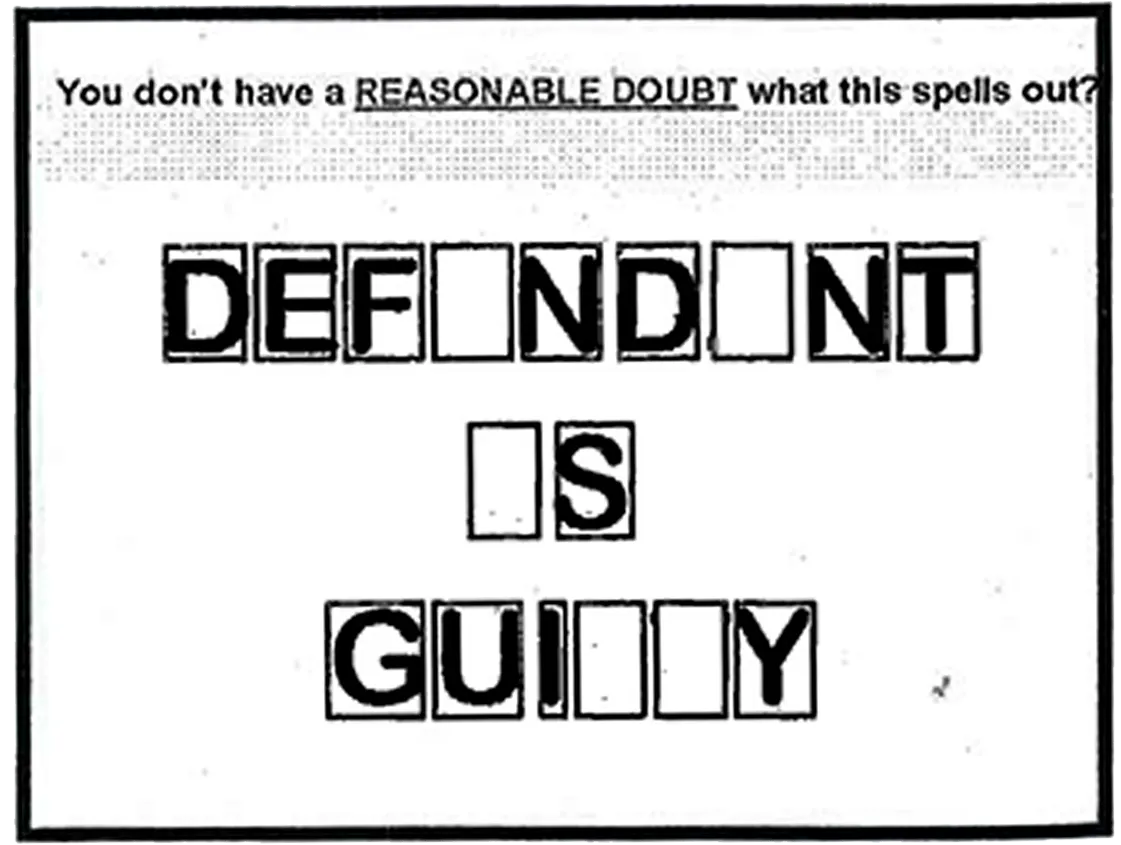
The book has lots of charts that make creative (and sometimes questionable) use of a defendant’s mug shot—putting it in a bull’s-eye, for example—and offers many suggestions on visualizing the concept of “reasonable doubt,” an undertaking that has landed prosecutors in trouble with the appellate courts time and again. One suggestion borrows from “Wheel of Fortune,” suggesting a slide that emulates the big board from the game show, leaving out a few key letters from the phrase “Defendant Is Guilty” and asking jurors to solve the puzzle.

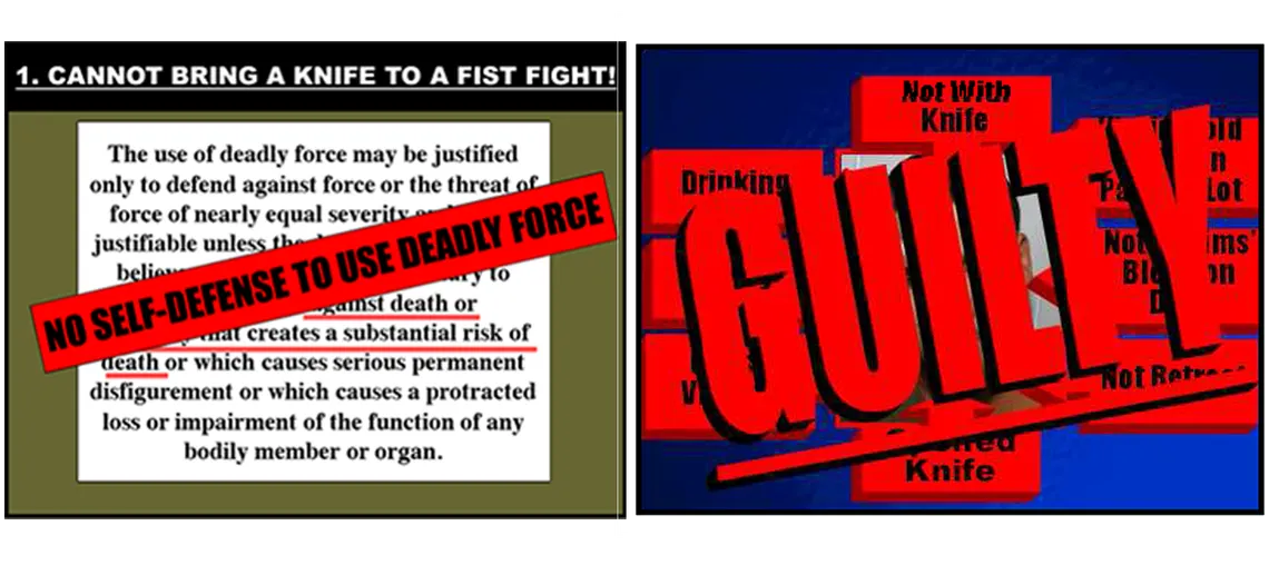
Another style of prosecution by PowerPoint: Slides that attempt to explain legal principles. Two months ago, an appeals court in New Jersey threw out two assault convictions in a case where the defendant claimed he was in fear of being stomped to death. In closing argument, the prosecution presented slides with “statements about the law of self-defense that were so oversimplified as to be misleading,” the court wrote. “Worse, those oversimplifications provided appealingly easy ‘take aways,’ as those schooled in PowerPoint presentations aptly put it.” Here are two of the prosecution’s slides:

Perhaps coincidentally, the state where prosecutors have gotten into the most trouble over the misuse of slides has been Washington—home of Microsoft, the maker of PowerPoint. Since August of 2012, appellate courts have reversed at least seven cases in the state. Some centered on inflammatory images; in others, prosecutors used slides that mischaracterized the beyond-a-reasonable-doubt standard or infringed upon a defendant’s right to remain silent, according to appellate rulings.
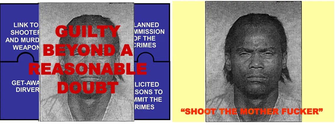
Judges have also criticized Pierce County prosecutors in cases where the convictions held. Last year, for example, the state’s Court of Appeals upheld the murder conviction of Odies Delandus Walker, despite finding that prosecutors improperly used modified photographs that had not been admitted into evidence. In the two slides below, the prosecution stripped language across Walker’s booking photo:
